
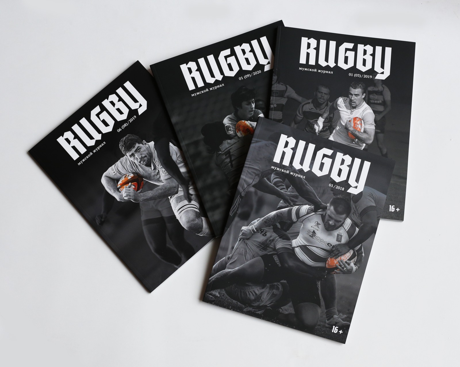
The phrase “corporate magazine” typically evokes a persistent association with something dull for most people. However, this does not have to be the case. The visual design of the Rugby Federation of Russia’s magazine, Rugby, developed by “People’s Architect,” has made this corporate publication trendy and interesting.
The bureau’s task was to present rugby players as brutal characters from an epic, as knights. For this reason, it was decided to use a medieval, gothic font for the cover design. Photos that reflected this story were also selected. The center of the magazine cover always features movement, the emotions of the struggle, rather than studio portraits of the players. To further enhance the dramatic effect, the covers were made black and white with an emphasis on one bright color element, such as the uniform or the ball.
As a result, the magazine became attractive not only to rugby fans but also to people who previously had no interest in this sport. Thanks to its design, it stands out among the magazines produced by sports federations in Russia and abroad. The approaches and visual techniques demonstrated in it are now used by other publications.